

The year was drawing to a close when the destination of Abilene, Texas announced its strategic rebrand. The area’s old logo, featuring a shooting star and the words, “Visit Abilene,” had been used since 2008 but it wasn’t really telling our story – at least not the way we wanted it told. Despite the fact that our destination had plenty of forward momentum, the old creative really hadn’t kept pace. Our consensus was that we needed to refresh our brand.
I was new to Abilene, taking over as vice president in March of 2022. I spent my first three months in meetings, getting to know the stakeholders, board of directors, staff and locals, and throughout that time, I was asking what we could do better. The reoccurring theme was we needed to update our creative.
We had plenty of discussions about it as a staff. Marketing and in particular, the creative, are critical to any city’s image; it gets the message out about who you are. If you’re doing it right, the city stays in people’s minds. The message needs to be something visitors see, understand and remember, and it also needs to make the people who live and work in a destination proud to do so.
Establishing a brand and implementing it, therefore, are incredibly important; it should never be something you rush through or fast-track. What follows is the process we used, how we came up with our new identity and how it is working out. While every city is different and will have a different story, I believe there are takeaways here for everyone.
Asking the Important Questions
As the first part of our process, we took a step back. We zoomed out and discussed our brand. What was it? What was our identity? Who did we think we were? Who did our customers think we were? What differentiates us from our competitors, both in Texas and in the country as a whole? Who did we want to become and how did we want to be seen?
The initial step in any rebrand has to be asking these questions because it just might be that everyone has a different idea – or that nobody is really sure. In our case, it was the latter. We spent time discussing the area’s history, its reputation in the marketplace and what we wanted to accomplish. We realized that our rebrand had to identify what made Abilene special, and then to tell our story in a thoughtful and intentional way.
This process helped us create our positioning statement, our promise to visitors. It articulates what we want Abilene to be known for, and what visitors can expect when they come here:
Abilene represents the frontier spirit by honoring its heritage while embracing the future. Its storied past gives rise to a charming and flourishing historic Downtown Cultural District with educational museums, urban parks and a public art scene featuring an unrivaled collection of storybook sculptures. Abilene’s authentic, welcoming sense of community and Texas traditions make for enriching experiences that create lifelong memories for visitors.
This statement is the foundation of our brand identity. It guides our future marketing efforts and influences the images we use, the copy we write and the personality of the brand. It states what sets Abilene apart and why only Abilene can satisfy visitors in this way.
Historical Significance
Something that kept coming up in our discussions was Abilene’s place in history. Abilene has played a very important role in the American West; in fact, it was founded in 1881 by cattle drivers as a stock shipping point on the Texas and Pacific Railway. The T&P had bypassed the nearby town of Buffalo Gap, which was, at that time, the county seat of the area.
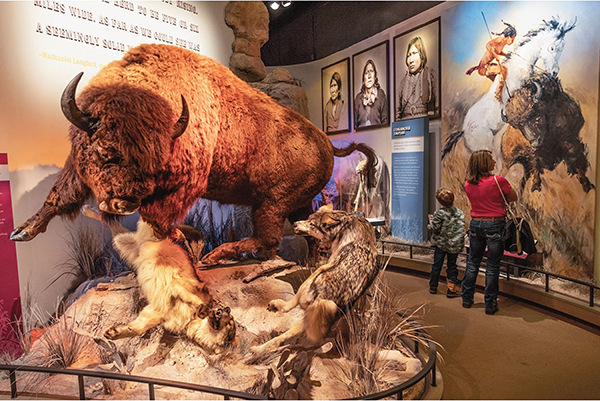
But even before Abilene was founded, the area was a major part of the Buffalo Trade, and the buffalo, is, of course, an iconic symbol of the West, emblematic of perseverance, determination and strength. To this day, you’ll see buffalo sculptures throughout our area, and you’ll also find pictures of buffalo used in the branding for boutiques and on signs along the highway.
Of course, since those days of ranching and roping and cattle driving, Abilene has grown in both size and industry; in addition to now hosting sports, the area is home to businesses in the retail, medical and transportation sectors. It has a thriving arts scene. Its downtown is undergoing an exciting revitalization and a convention center hotel is about to open. It was our decision that our rebrand should capture what makes Abilene unique while at the same time remaining true to its heritage. And the buffalo was all about resilience; it had been hunted almost to extinction, but it survived by adapting and changing – the same way Abilene has reinvented itself over the years to remain relevant.
Continuing the Theme
Once we had a visual image that was unique to the area, was a nod to our history and was simple, eye-catching and memorable, we still needed our logo. That was a challenge too. We wanted something simple, clean and timeless. And we found it right in front of our eyes.
Our office is the town’s old train station. It has a white plaque with black letters with the name of the town. It was a simple sign, it was in a clear, readable font and it was echoed on another historic building, the Abilene Courts, a 1930s-era motor lodge with a very similar sign, one that had been hand-painted in the business’s heyday. Suddenly, everything made sense.
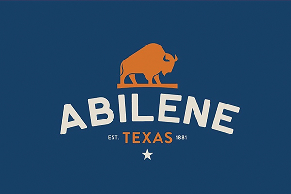
We worked to try to make the logo look like one of the town’s historic bricks made at a local factory; the orange in our logo reflects the color of those bricks. We kept the original format but tweaked the design so that it would look good on everything from Instagram to billboards to business cards. In other words, this is a design that was inspired by tradition but made for today.
The New Brand Debuts
 When the completed rebrand became public, we were surprised (and happy) to see how well people embraced it. They loved how eye-catching it was and how it paid tribute to the history of the area. They understood that a lot of thought had been put into this, and they really appreciated the result.
Since the new brand identity went public, I’ve been surprised how many people have stopped in our offices. Here are two examples of times that has happened:
One woman stopped by and told me, “My father worked in the brick factory here in Abilene 40 years ago, and it’s so nice that you’re honoring it.”
Another time, a gentleman came in off the street and met with me. He said he thought the logo design was great; he had also written a book called Abilene in Song and he presented me with a copy of the book as a token of his appreciation for all the thought that went into the rebrand.
In fact, it’s become surprisingly normal for people in the community to come by unannounced and tell us they love the logo; I love seeing it because it shows their pride in the destination. Everyone has a story about Abilene and the rebrand seems to have encouraged them to tell it.
Sometimes, we’re asked why the logo does not have the words, Convention and Visitors Bureau, on it. That’s easy: The community owns the Abilene brand; we are just the stewards of it. That’s a very big responsibility when you consider the fact that the people who own this brand date all the way back to before the area was urbanized and certainly before there was a CVB. We want Abilenians to feel proud of it and to know they are a part of it. If people see the design and think of the city, rather than the CVB, we’ve done our job.
Our city has so much to offer: arts, sports, business opportunities and more. We want to paint a picture in people’s minds about what a great place it is, whether they are looking for a college, scoping out a tournament location, identifying a site to house their business – or just to put down roots and have a great place to live and work. We want our brand to stay in their minds whenever it comes time for them to make those choices.
Why We Succeeded
This rebrand worked for a number of reasons. The first was that we were very mindful about making sure the image we were creating was something that embodied our whole community. We are under the microscope of our stakeholders, so we did not want something that was self-serving. The new brand does not simply promote the area in order to bring in tourism. Our old creative was more outward-facing; it did not really capture the spirit of the area or speak to its history and people could not really embrace it for those reasons.
Our new campaign also succeeded because we asked the important questions about what we wanted our identity to be and how we wanted Abilene to be perceived. Additionally, we were open to new ideas and different ways of doing things – something that has allowed Abilene to grow and thrive all these years. The community was open to change, as well, and our timing was perfect.
Time Frame
It took us three months to move through the process which is probably a lot faster than normal. Our previous brand, I am told, was 12 months in the making. Obviously, there is no set time frame that works for everyone; in this case, we had an enormous sense of community pride and people were very engaged and were quick to tell us what they thought. Because of that, we were able to move a little faster. We knew how to access the right people, which helped a lot.
Abilene is unique and its rebrand took advantage of what makes it special. We succeeded by tapping into our history and honing our storytelling skills by using meaningful words and powerful imagery to match. We needed a brand that was fresh and appealing not just now but in three years, five years or even more. We needed a brand Abilenians would be proud of and rally around its purpose, and I’m grateful for the positive reception we’ve received. SDM
Related Organizations
About the Author